Systems
AUXMFG design system
Figma and code as one system. The same tokens drive the desktop and the phone.
The problem
Auxiliary Manufacturing needed a storefront, emails, and print that all looked like one brand. They also needed the next person, or the next agent, to be unable to break it. A Figma file alone does not do that. A designer drifts, a developer hand-translates, and six months later nothing matches.
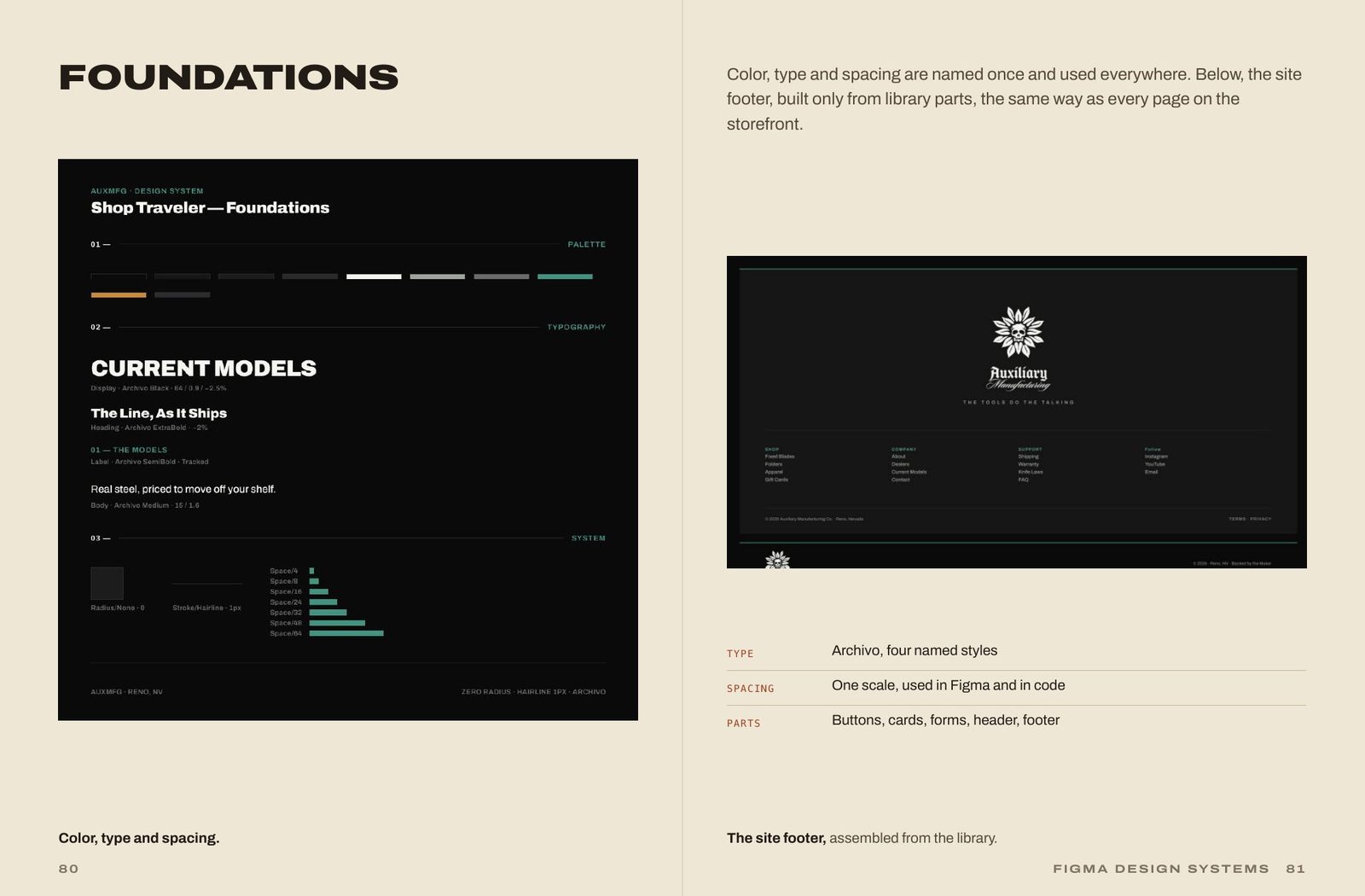
I built the library in Figma and in code at the same time, and made them the same object. Every color, type style, and spacing value is named once and used everywhere. Every part is a named component with its states: hover, selected, sold out. The storefront and the emails are built only from these parts, so a change in the library changes everything. Figma, the code, and the live theme stay in sync. None of them wins alone.
One library, two surfaces
The Figma file holds the parts. The code holds the same parts, with the same names and the same states.
Six tokens are the responsive design
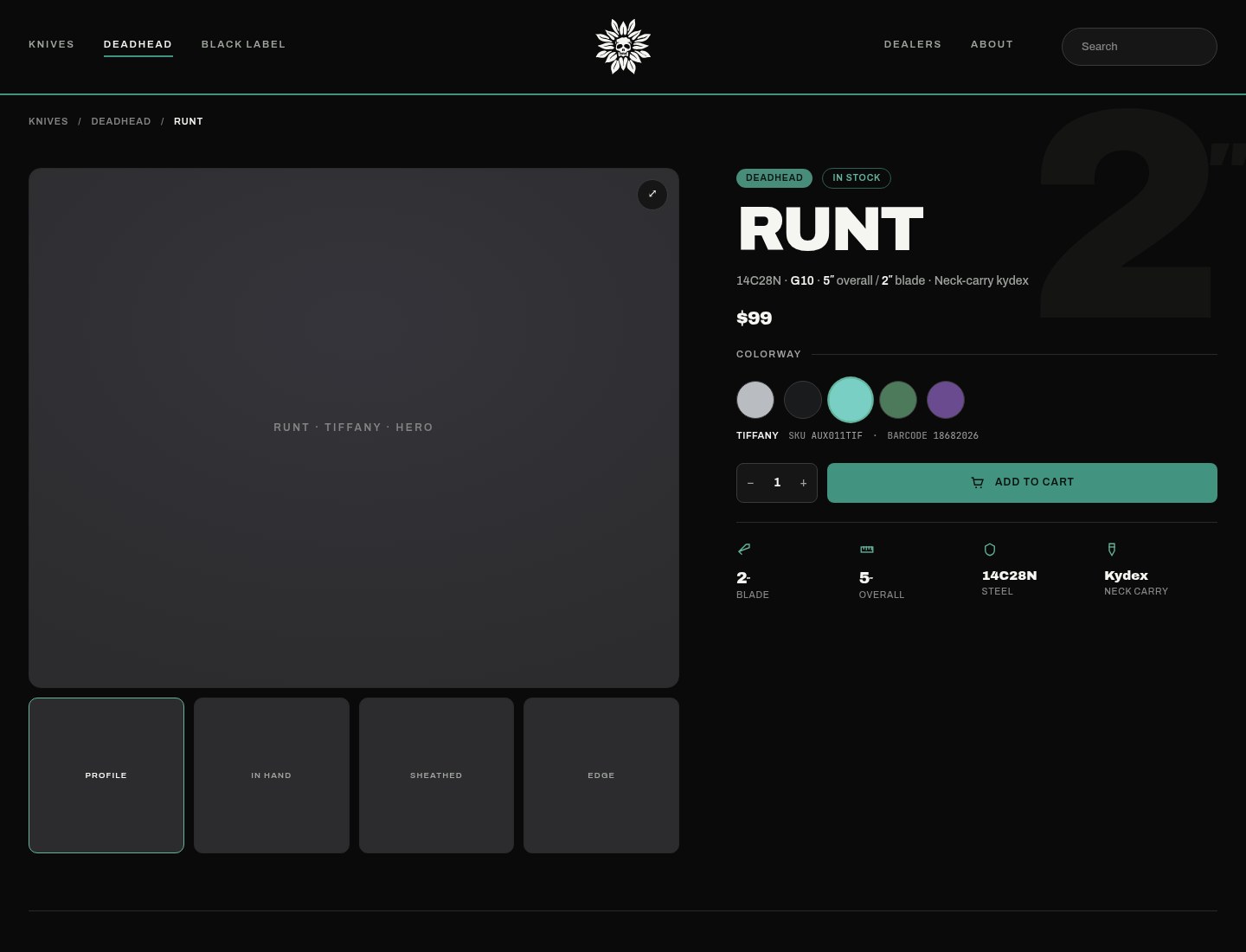
The AUX Theme collection has 39 variables in two modes, Wide and Compact. Exactly 6 of the 39 differ across modes, and those six are the responsive design. Each becomes one CSS clamp(). There is no separate mobile design. The 390px page is the Compact mode of the same tokens.
| Variable | Wide | Compact |
|---|---|---|
| gutter | 99 | 22 |
| tab-pad-x | 22 | 11 |
| hero-display | 56 | 34 |
| head-display | 36 | 26 |
| deck | 15 | 14 |
| ghost-display | 300 | 96 |

Components with every state
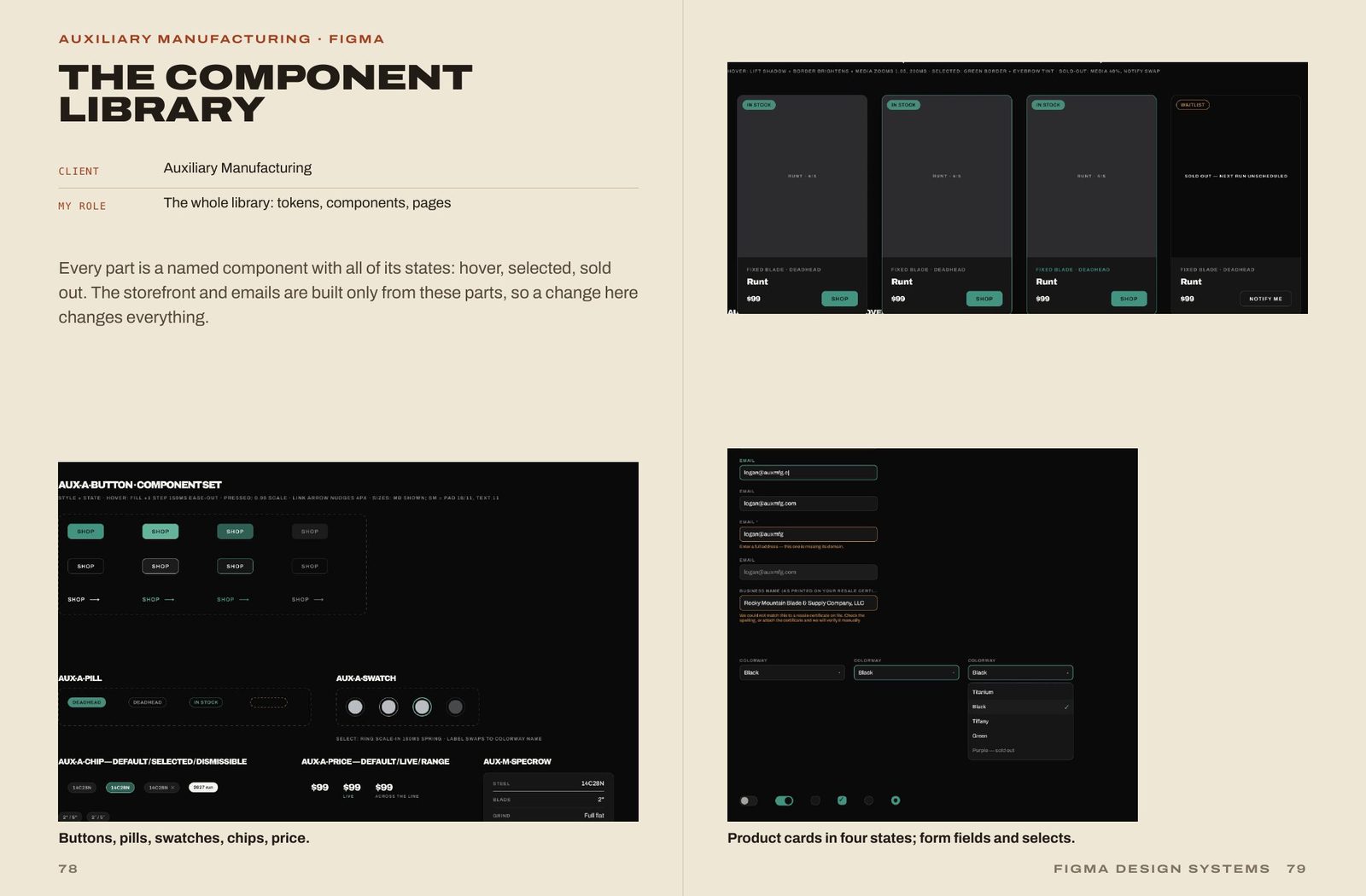
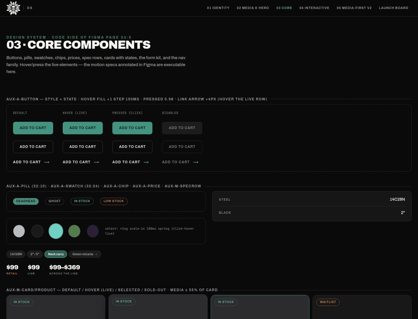
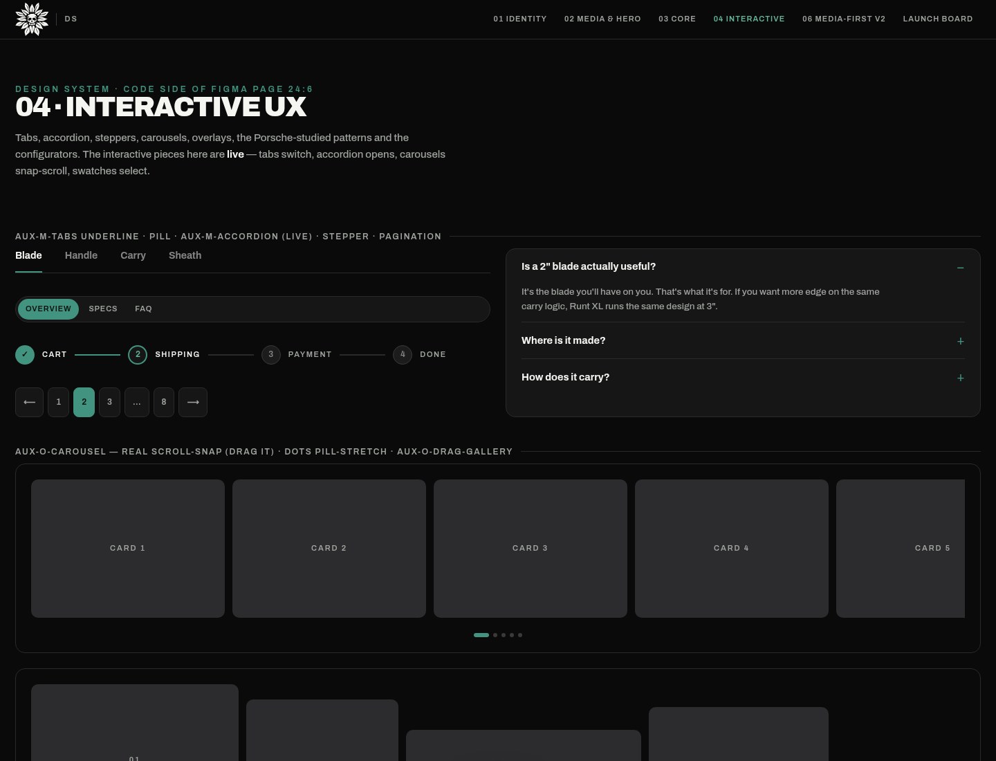
Buttons, pills, swatches, chips, price, product cards, and forms each carry their states. Tabs, accordions, steppers, carousels, overlays, and configurators are live in the browser, not drawings of a hover.
Rules that are audited
Media is locked to 4:5 portrait, contain, on #2C2C2E. Never cover, which crops the product, and photography never dictates layout.
Accent buttons always carry dark ink, because light ink on the green and the amber lands at 3.37:1 and 2.69:1. A contrast table governs the pairs. I raised --ax-ter to #848484 and set pill-fill to #488c7a so the pairs pass.
Every component declares a text-length contract. The product-card name is a fixed 2-line, 36px box, so a one-word title and a six-word title take the same space and the price rows stay aligned. Every interactive control gets a visible, offset focus ring.
The audits can fail. Zero overflow, zero unbound fills, and zero off-scale spacing at 1440, 768, and 375. The first run did fail.
Overflows, first audit, then fixed
- 375520
- 768140
- 144010
One spacing scale
The scale is used on padding and gaps alike. The retrofit made 227 variable bindings across 98 frames, and snapped 341 spacing declarations in code onto the scale.
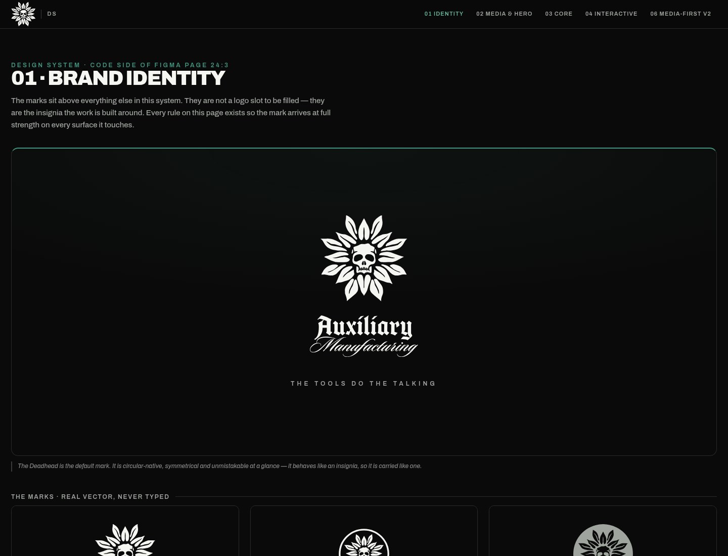
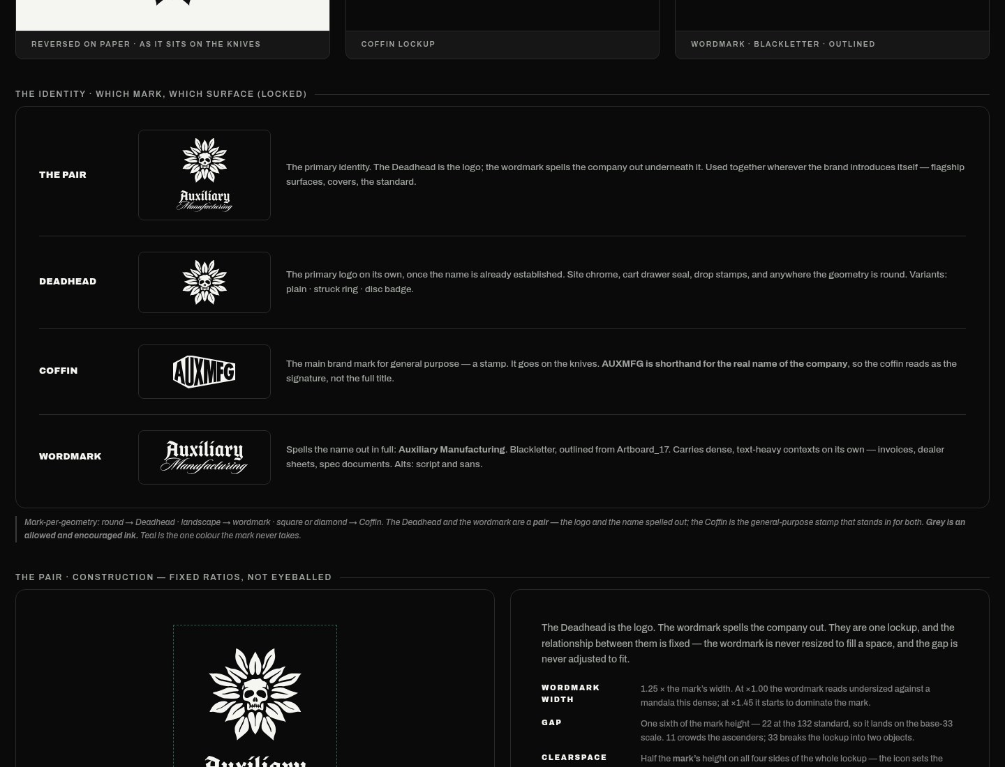
Brand marks are an insignia, not a logo slot. The Deadhead and the wordmark are a fixed pair: wordmark width is 1.25× the mark, the gap is the mark height divided by 6 (22 at the 132 standard), and clearspace is half the mark height. I settled that from a nine-way balance study.
Pages built only from parts
A media-first study rebuilt the page around product photography. The home template is assembled entirely from library sections.
The first flagship library
An earlier pass, in its own file, had 23 token-bound components, with about 445 solid fills and strokes rewired to variables. Home, the product page, and the collection were captured from the live site. The home page alone is 9,406px tall. 22 cards were swapped to instances, and mobile pages were captured at 390.
An email kit of about 20 components sat with them. All 60 masters were consolidated on one Master Components page, and text styles were linked: 236 applied on desktop, 280 on mobile.
The flagship product page was built code-first and imported, 13,243px tall: 60 components, 19 organisms, 24 molecules, and 17 atoms, with 60 of 60 naming conformance. The same IDs are shared across the repo and Figma. The system grew to six pages, including the media-first study, with two-way sync through data-figma-node on each section.
Figma to Shopify, written down
I wrote the method so the file can become theme code without a private translation.
The order is Step 0 through Step 7: read the file as a designer, keep tokens with their modes, set type by role, take layout primitives from what auto-layout actually means, build components last, design the responsive behavior and write it down, start from real content, and verify in a way that can fail. That verification is a Figma PNG against a page screenshot at 1440, 768, and 375.
I also wrote a failure index, F1 through F14, of mistakes I had made and how to spot them. Fourteen Liquid templates run over fixtures. The first section on the dev theme was Find a Dealer.
| Figma | Theme |
|---|---|
| Prototype frame | Template |
| Organism | Section |
| Atom or molecule | Snippet |
| Variant | Setting |
| Text property | Schema field or metafield |
The theme
I built the AUXMFG Shopify theme from this library. One cleanup pass took the stylesheet from 99KB to 42KB, and inline styles from 45 to 0.
The same tokens drive the 1440 desktop and the 390 phone. The rules are written down and audited.